The Finishing Touch: Color
I was working on a project with my friend Jim yesterday and we were discussing woodworking finishes. He stated that woodworking is one skill and finishing is another altogether. I couldn’t agree more. This description matches my experience exactly. I’ve been spending a lot of time thinking about and experimenting with color. As a woodworker I love and appreciate the look of a beautiful piece of wood but Inevitably find myself most attracted to brightly colored folk art pieces. The color adds so much spirit and playful energy to wooden pieces.
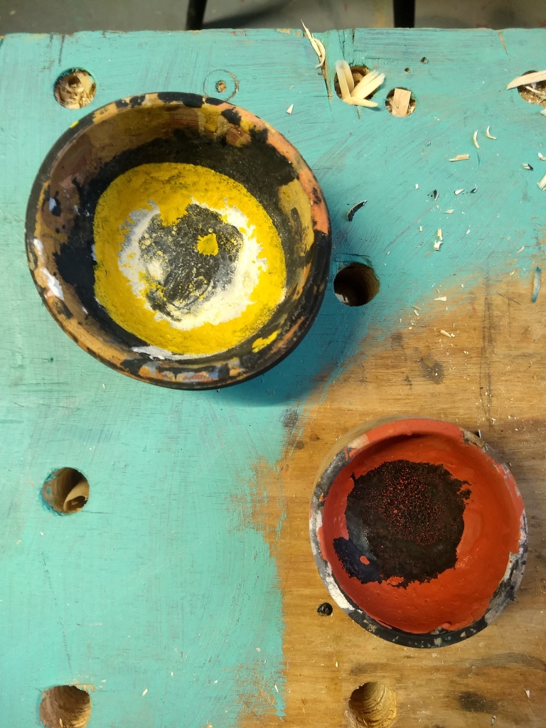
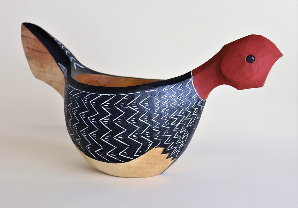
I’ve reflected on the nerve racking moment when a piece is finished and the wooden box full of painting supplies makes its way to the bench. The bird bowl is shaped and the details are carved, now it’s time to add a simple splash of color. Simple, right? Not always. Over the course of the last year I made of series of bird bowls that you may have seen examples of in some past posts. But there are a few that have been fully painted 3 different times. I finish the piece, enjoying the shapes and patterns then proceed to “ruin” it with paint. Fortunately, I can usually cave off the very surface layer leaving me a redemptive second chance. After going through this time consuming and frustrating process many times I felt compelled to start thinking a little more deliberately about color. It’s an important topic for me to understand since I love using color in my work. Even with intentions to improve I find making intuitive decisions about form and details much easier to come by.
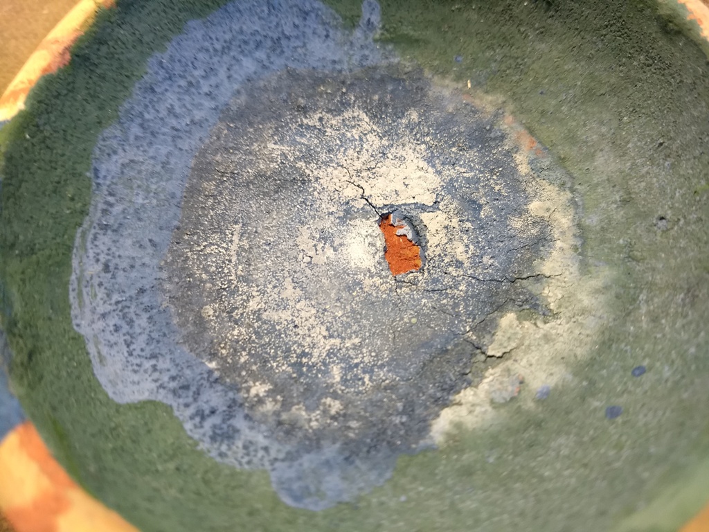
I use a lot of milk paint. Milk paint is a lovely option due to its porous matte finish as well as its non-toxic attributes. Casine, the protein found in milk, acts as a binding agent and mixed with hydrated lime (the remains of ancient crustaceans), mineral pigments for color, a bit of water and you have yourself a nice durable paint. The commercially available milk paints are easy to use. They come as a powder and all you need to do is add water. There are, however, some significant limitations in the palette of colors to choose from.
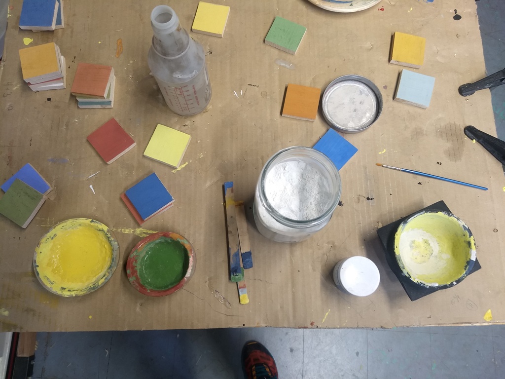
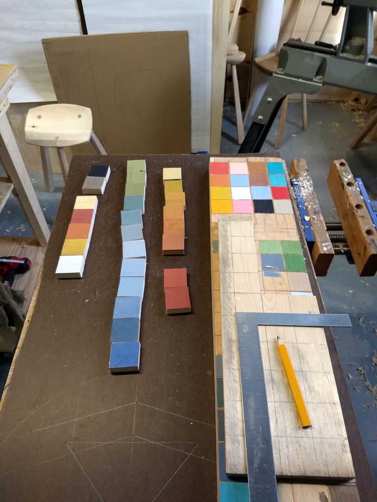
I started mixing up various mixes of paint options to create small wooden test tiles in order to have a quick reference when working through my options. It is undoubtedly helpful but that in itself has its own set of limitations. Selecting a color palette is one thing but scale and proportions of color in relation to one another have a dramatic effect. Check out these examples.
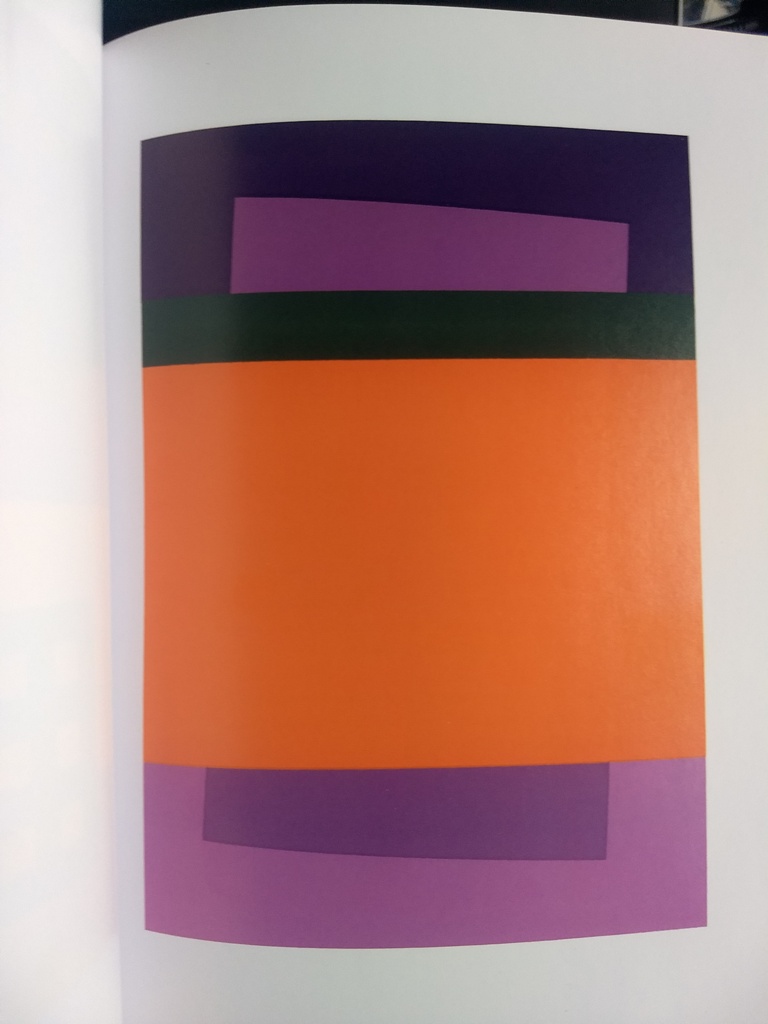
The book “Interaction of Color,” by Josef Albers has some great color studies that highlight some of the wild optical illusions of colors in relationship to each other. For example in this photo the two purple wedges are the exact same color but our eyes perceive these shapes as two separate colors due the surrounding background colors. This just highlights how complicated our visual perceptions can be.
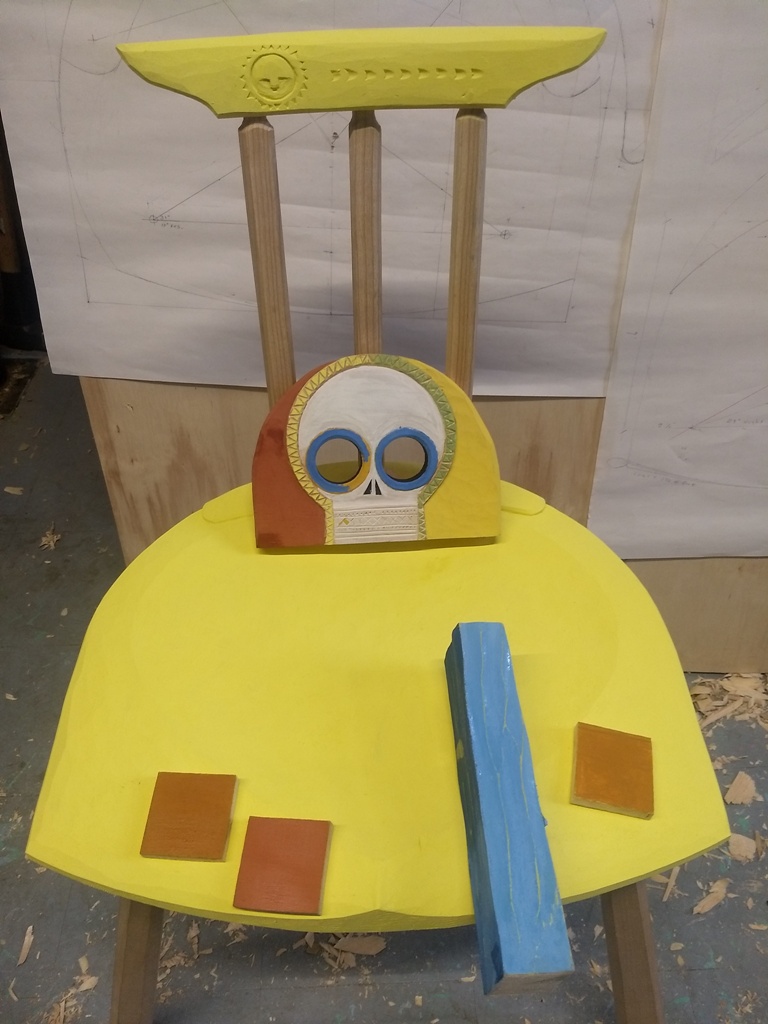
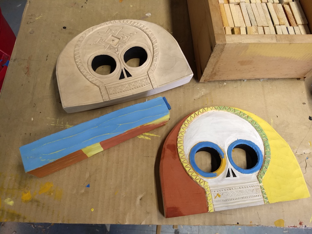
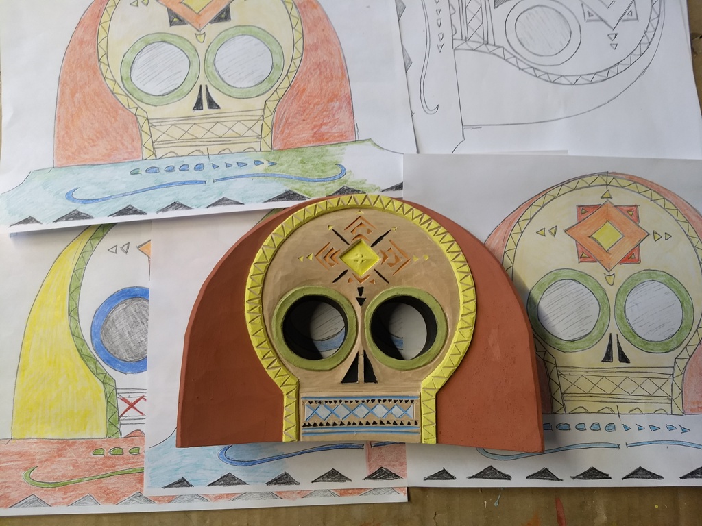
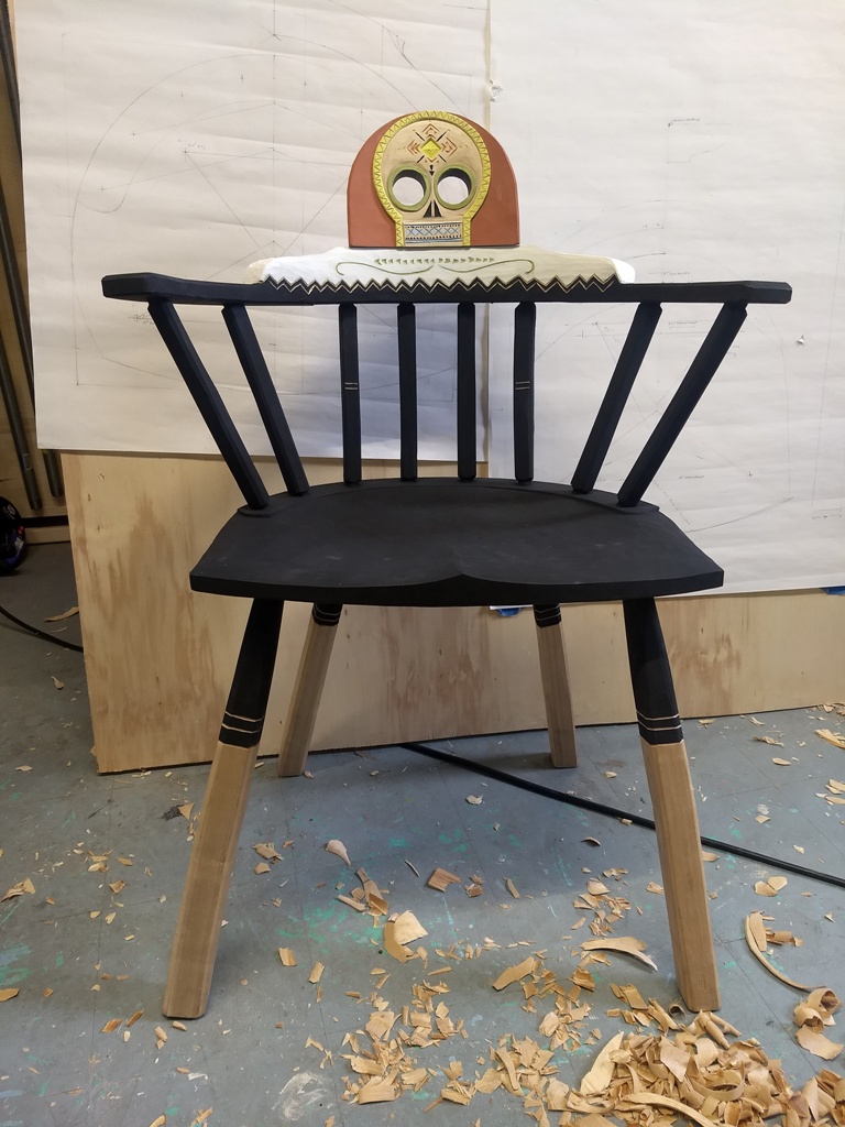
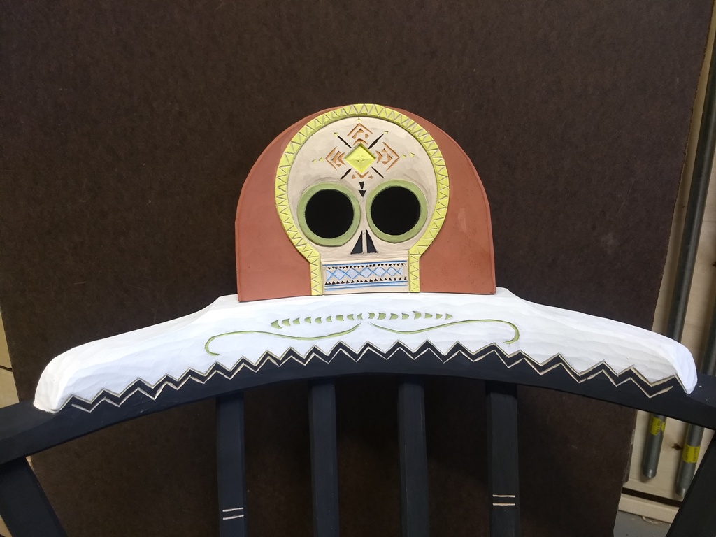
In my last blog post I shared a stick windsor project I’ve been working on that’s capped by a carved skull. I was giving that project a break but felt compelled to finish this off as the season are shifting and new projects are on the horizon. I started by using my test piece to play around with some color combinations. Additionally, I made some photocopies of the original sketch and colored them with colored pencils as another low risk way of testing color combos. This was a step in the right direction. There’s some photos here of the chair in its current state though it may still change a little bit. I’ll let it sit in the corner of the shop for a while and see how my brain reacts to it over time. This color game is an ongoing challenge and I feel grateful to be able to explore it!